Have you ever looked up at the sky and wondered what kind of star our sun is? Or wondered if all the stars in the sky were the same? The truth is that stars do have a classification system. After all, you wouldn’t say that our sun is the same as Polaris, the North Star. Every visible star in the night sky has been categorized.
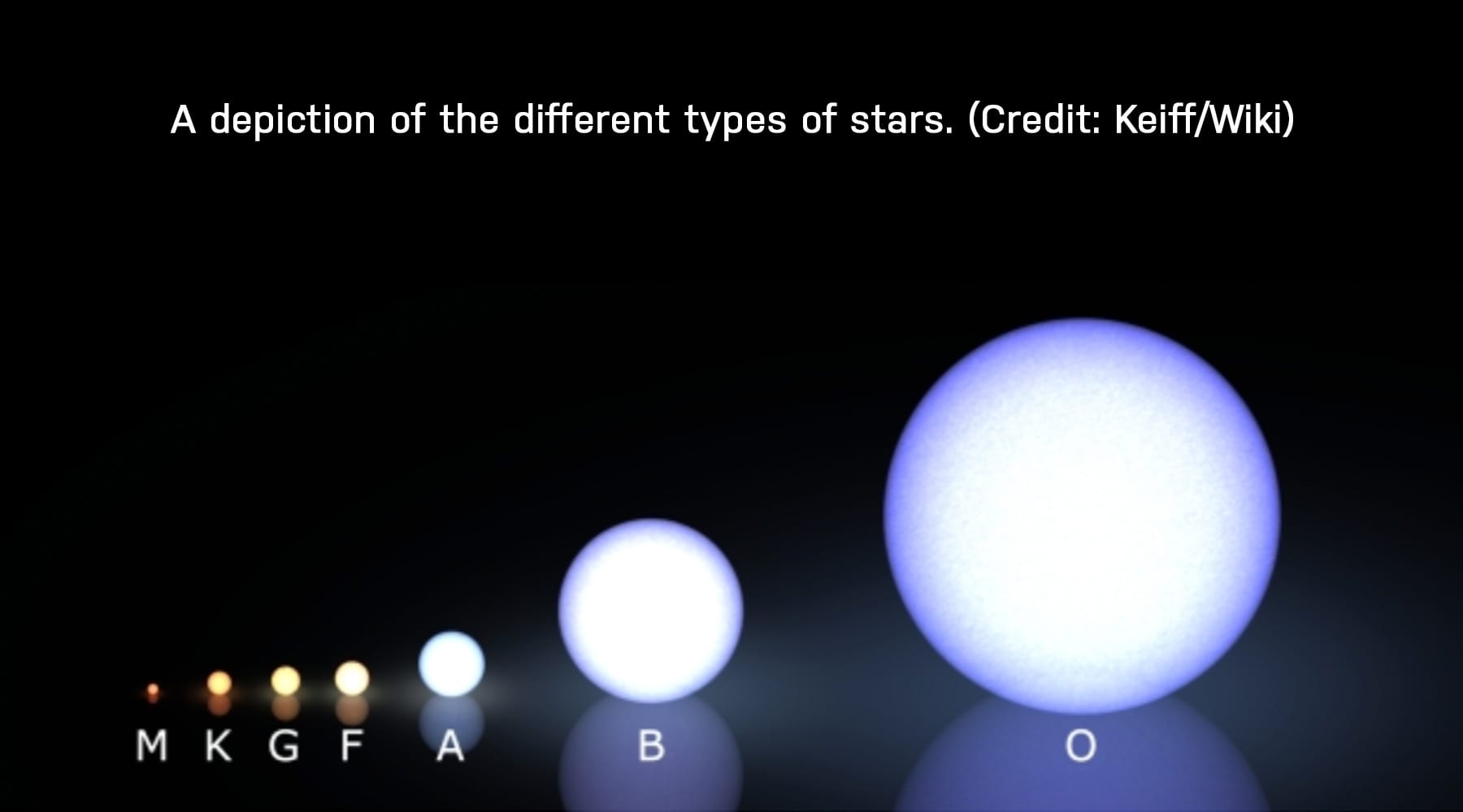
People have been classifying stars since the beginning of time based on the way they look or how bright they are. As science became more advanced, the classification system has advanced, too. In 1901, astronomer Annie Jump Cannon made the system we use today called the OBAFGKM system or the Morgan-Keenan system (MK). This system breaks stars down into 7 groups based on their temperatures. These 7 groups are then broken down into 10 subgroups from 0 to 9, with 0 being hotter than 9. As seen in the image below, O stars are the hottest/biggest and M stars are the coldest/smallest.
When you look up at the night sky, you’ll notice that stars are not all the same color. Some stars are brighter, and some are dimmer. Some are more bluish and some are yellow like our sun. A star’s color is determined by its temperature. Hotter stars, like O stars, are more blue and the spectrum continues through white, yellow, and finally red. Similar to a flame on the stove, the hottest part of the flame is blue and the coolest part is red.
The hotter a star is, the less common it becomes. For example, O stars make up about every 1 in 3 million stars. M stars on the other hand, make up about 75% of all the stars we see. Our Sun is a yellow star and is classified as a G star, more specifically a G7 star. It is an average star running at about 5,800 °K.
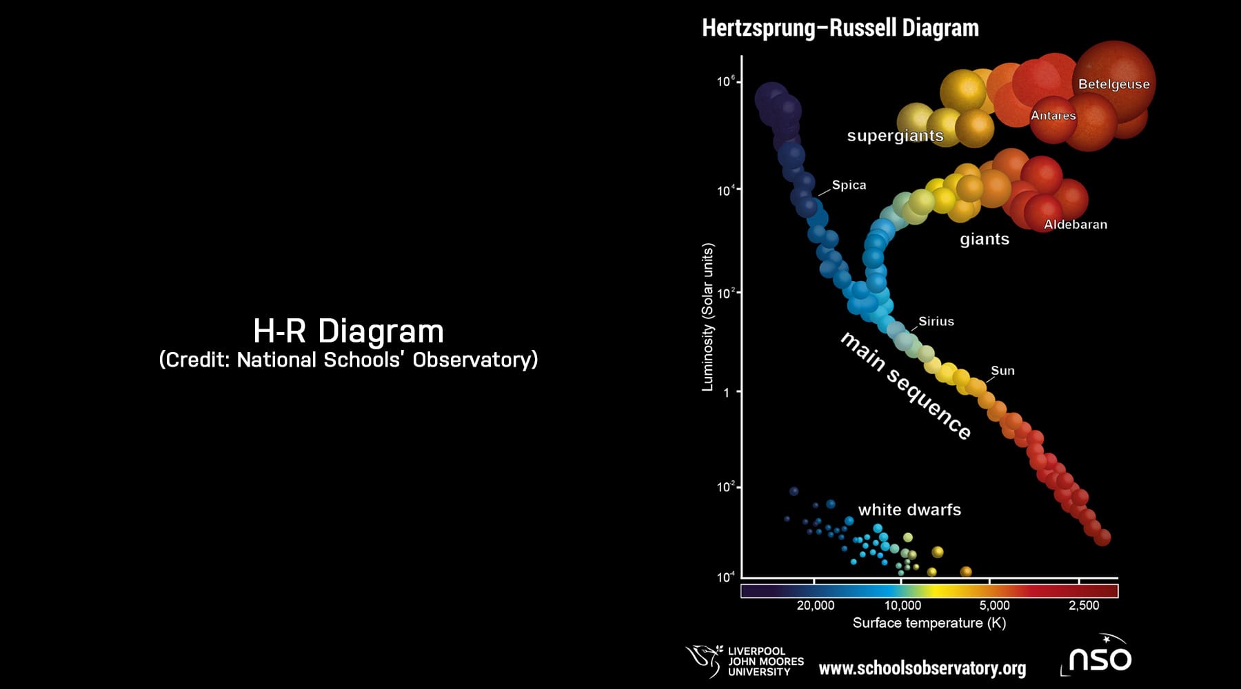
The Hertzsprung-Russell (H-R) Diagram is another tool astronomers use to understand stellar classification. It was created in 1911 by Enjar Hertzsprung, who plotted magnitude and color, and then in 1913 by Henry Norris Russell, who plotted luminosity and temperature. Later on, astronomers combined both charts into the chart used today. Often called the H-R Diagram or the Color-Magnitude Diagram, this graph is used to chart the life cycle of stars and study star clusters/galaxies.
But first, what is luminosity? Luminosity is the amount of energy something emits. For an object to be luminous, it must have its own source of energy. Stars are considered luminous objects because they shine due to nuclear fusion.
You might be wondering, what does a H-R Diagram do that the MK system does not? Well, if we only used the MK system, then one might think that stars with the same temperature are all the same. Using an H-R Diagram, we see that stars with the same temperature can have different luminosity levels.
There are multiple versions of the H-R diagram, all of them with different uses. Some pit luminosity vs temperature and others pit color vs magnitude. Some even have all four measurements on one chart! Color and magnitude are easier to observe than luminosity and temperature, so astronomers tend to use the chart called the Color-Magnitude Diagram (CMD). The luminosity vs temperature chart is easier to understand for beginners as depicted in the image above.
Most stars get plotted on the band running diagonally from top-left to bottom-right, as seen on the diagram. These stars are in the longest portion of their life, the “main sequence” stage, also referred to as a main sequence star. During this stage, a star’s core fuses hydrogen into helium. Main sequence stars get brighter as their temperature rises because the mass of a star controls its temperature and brightness.
On the top-right of the diagram, we see stars that are dim but also bright. These stars are called giants and supergiants. Stars like those are in the final stages of their lives where they expand and cool. As a result of their bigger size, they shine brighter too. The white dwarfs are plotted on the bottom left portion of the diagram. A white dwarf is a small, hot, dense star with a similar size and volume as the Earth. White dwarves may be hotter than main sequence stars, but they are dimmer. This is because they are smaller but more dense.
To reiterate, stars are big balls of gas that produce light through nuclear fusion which are classified into 7 groups. These groups from hottest to coolest are O, B, A, F, G, K, M. Each of these groups are split into 10 sub-groups, labeled 0-9, with 0 being hotter than 9. Stars are plotted onto a graph called the Hertzsprung-Russell Diagram, on an axis of luminosity vs temperature/color vs magnitude. The H-R Diagram is used to help visualize the classification of stars.
The classification of stars is a lot deeper than just the MK system and the H-R Diagram, but I hope this article will be a good starting point for any of our future observers! Happy stargazing!
Fun Fact: The mnemonic used to memorize the classification system is as follows:
Oh Boy, Another Flying Giraffe Kicked Me!
Sources::


